Role and Impact
I worked closely with both the Product and Marketing teams to create a cohesive visual system and a library of over 300 assets.To do that properly, I had to understand how everything actually worked – from SMS decision trees and predictive DNA modelling, to dynamic reallocation of appointment slots. This wasn’t about making things look nice. The visuals needed to be accurate enough for product teams, clear enough for clinicians, and compelling enough for commercial conversations.
– Used across sales decks, marketing campaigns and conferences
– Increased engagement during demos
– Adopted across departments
– Helped conversations focus on outcomes rather than mechanics
It gave teams a shared language for explaining complex systems simply.
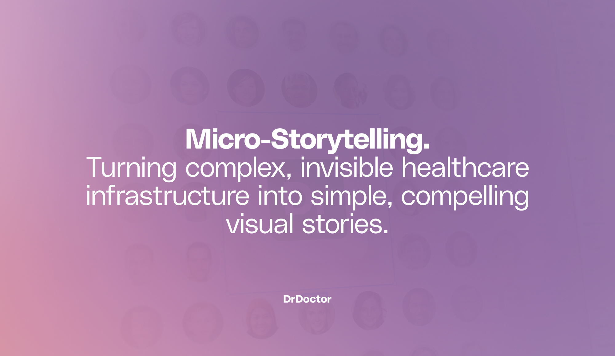
📖 My Approach
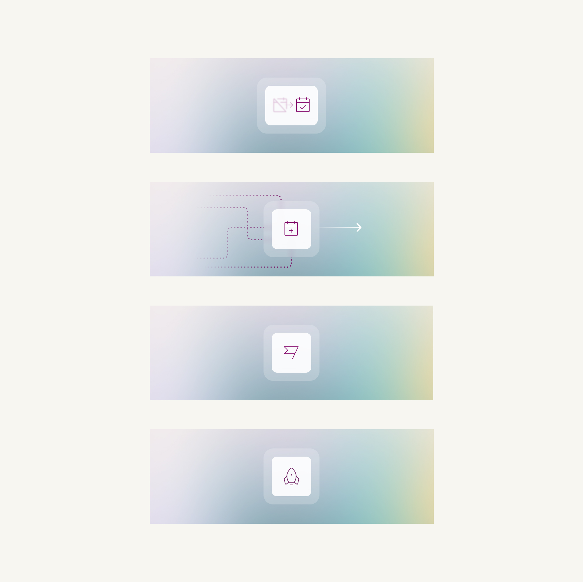
We called the approach Micro-Storytelling. Each asset told one clear story – in a single image. A scenario.
A cause. An outcome.
The visuals weren’t literal screenshots of the UI. They were designed to communicate value, not interface. This meant sales teams could explain sophisticated infrastructure in seconds.
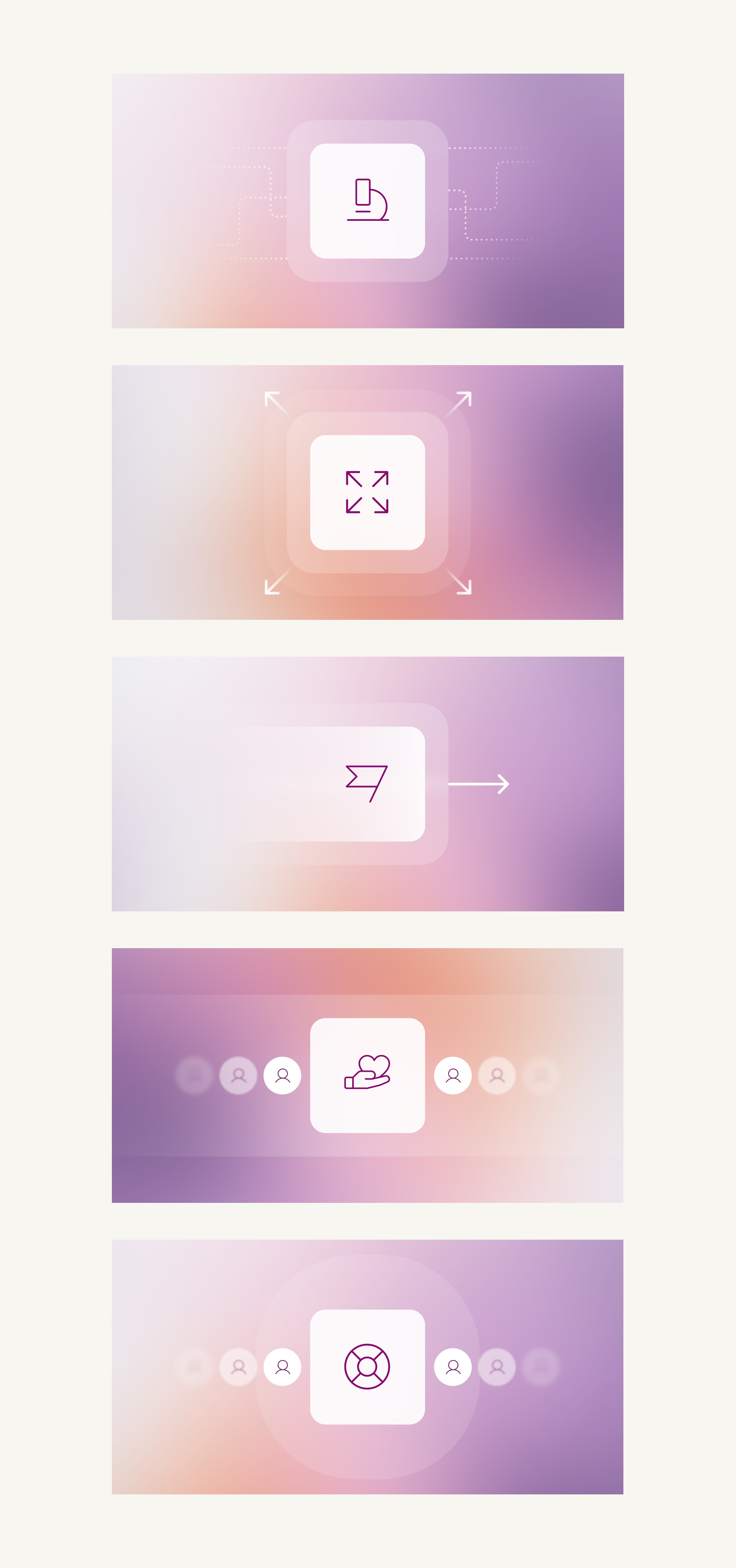
Rather than presenting isolated graphics, the work was grouped into themes...
💻 From Features to Outcomes
Before diving into mechanics, we focused on the bigger picture.
– Reduced DNAs.
– Fewer inbound calls.
– Faster deployment.
– Clear cost savings.
These visuals helped decision-makers immediately understand why it mattered.
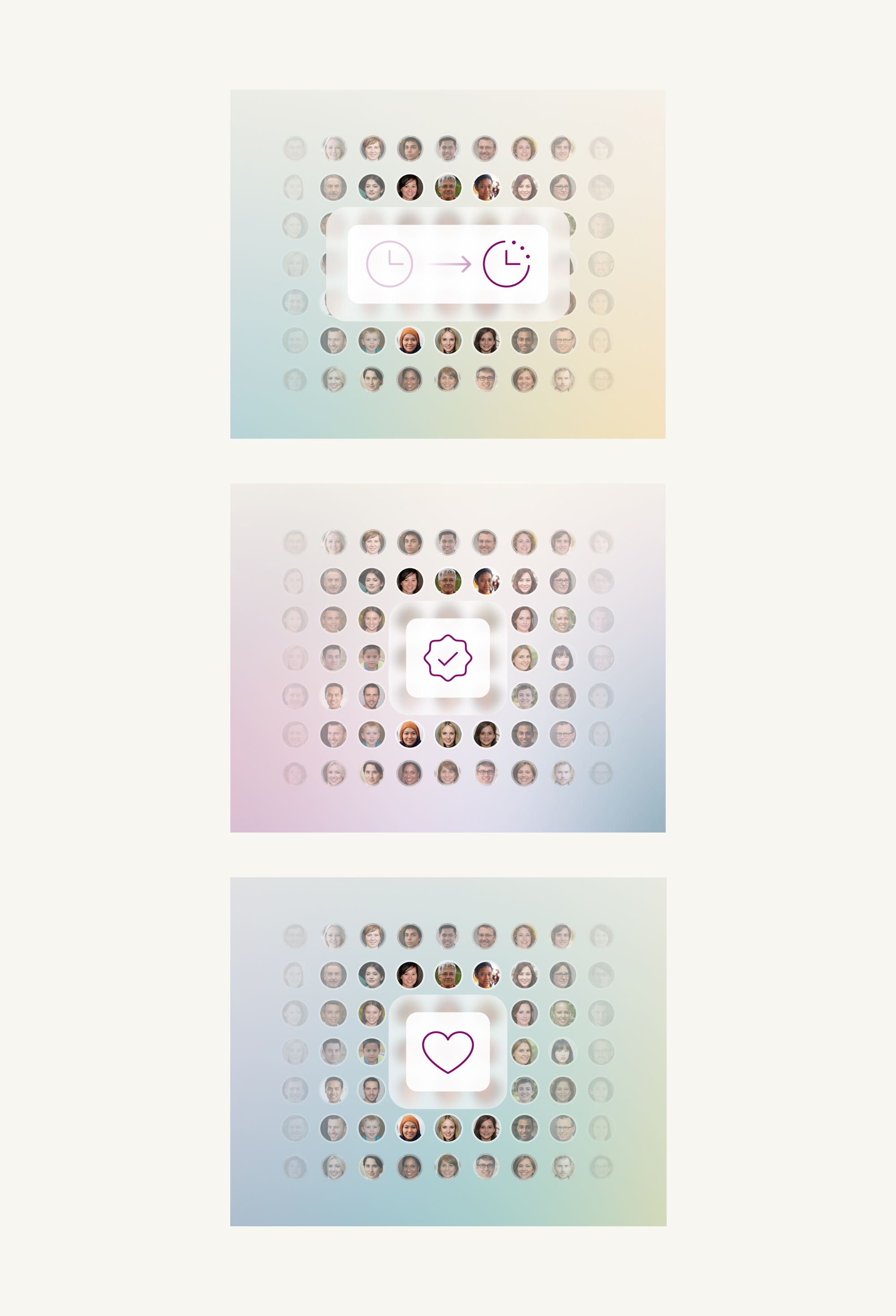
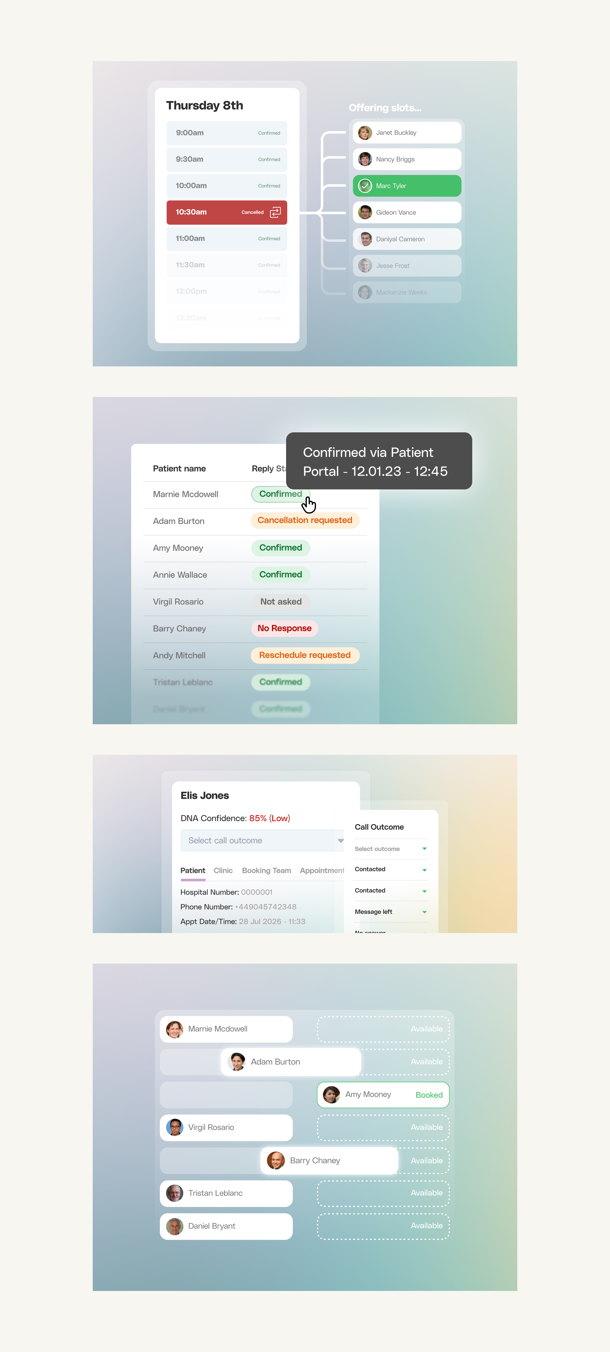
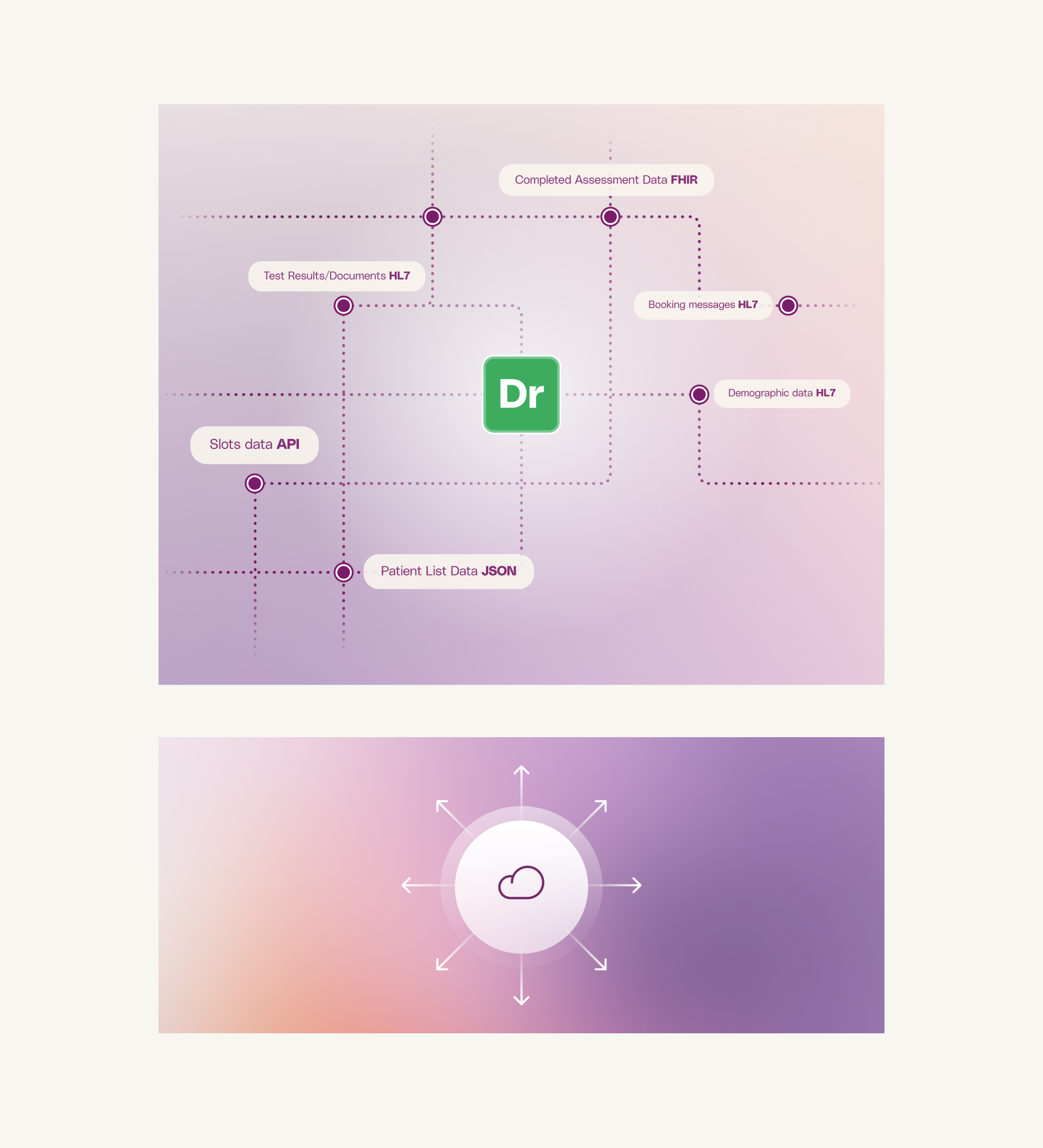
🗓️ Capacity Optimisation
One set of visuals focused on making operational logic feel human.
DrDoctor can identify empty clinic slots, reallocate them dynamically, and offer earlier appointments to patients who want them. It can also predict the likelihood of non-attendance based on demographic and behavioural data. For example – are city-based men in their 30s more likely to skip appointments in summer? If so, the system can send a well-timed reminder.
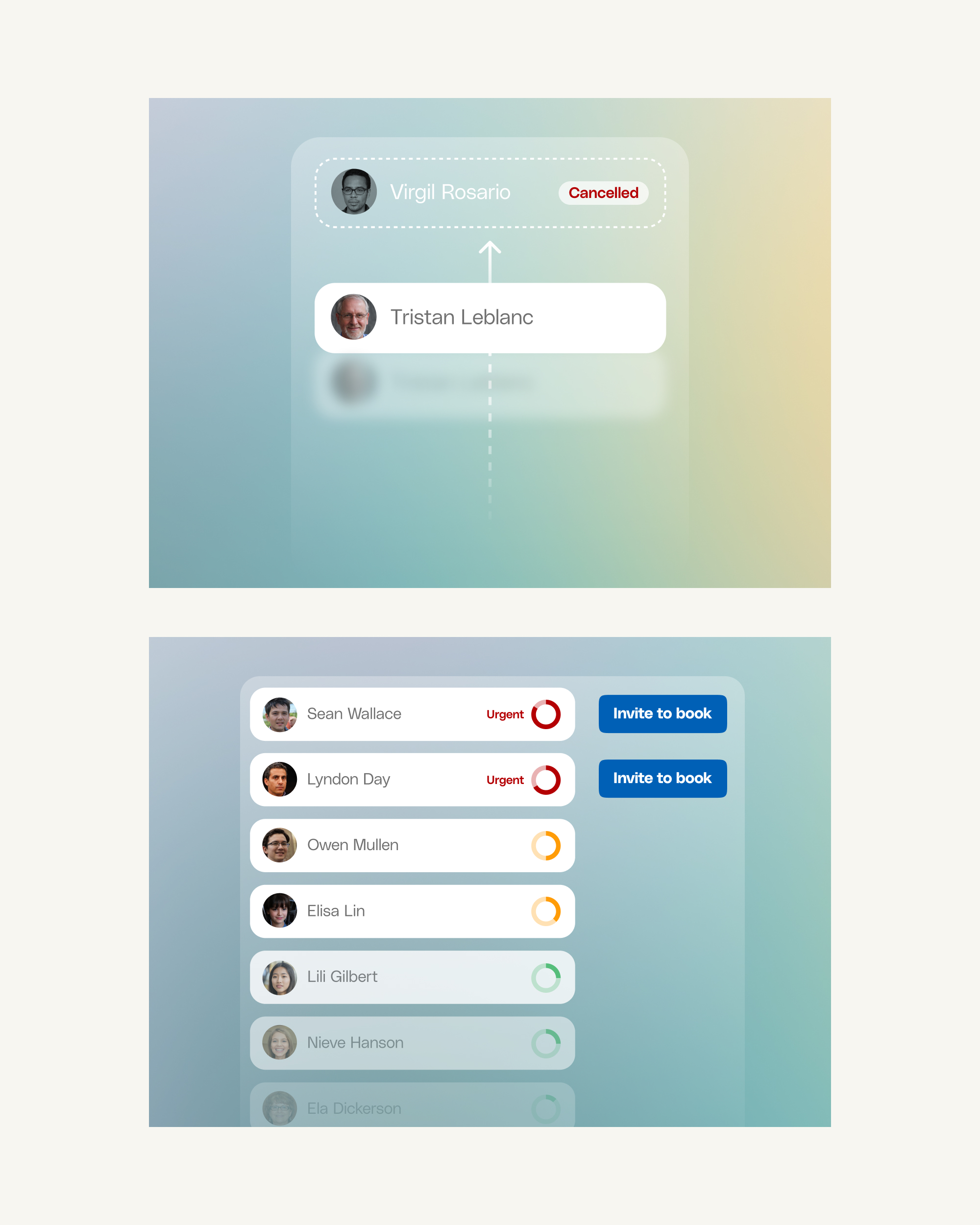
🔀 Intelligent Patient Pathways
One of DrDoctor’s most powerful capabilities is its ability to turn simple patient responses into structured care pathways. Patients can reply “Yes” or “No” to SMS prompts – but behind that simplicity sits intelligent branching logic, clinical rules and automated next steps.
A single response might:
– Trigger a follow-up questionnaire
– Route a patient to the appropriate service
– Prioritise based on clinical need
– Escalate to a clinician if required
These visuals helped stakeholders understand that this wasn’t just messaging – it was structured, clinically-informed automation.
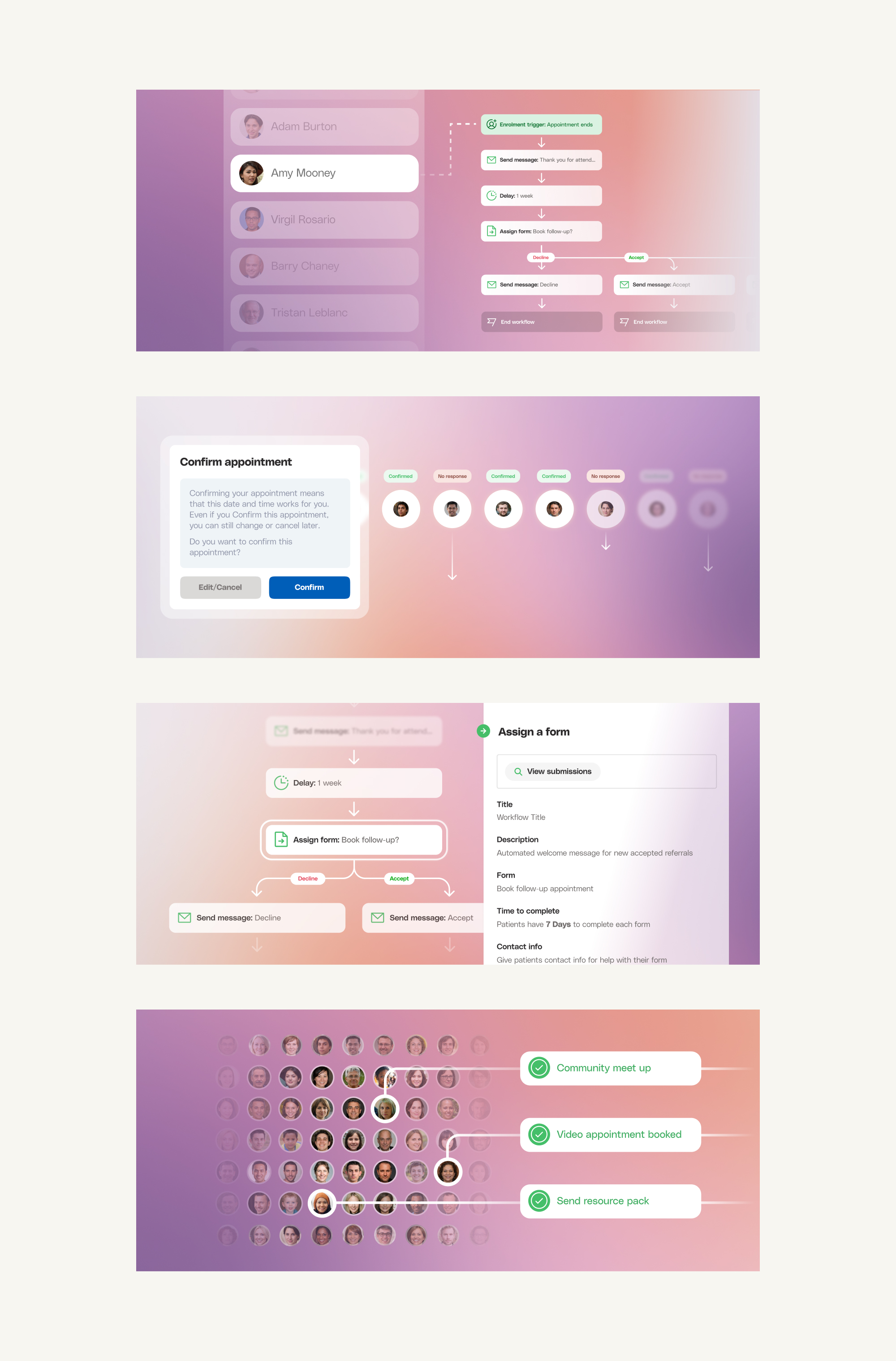
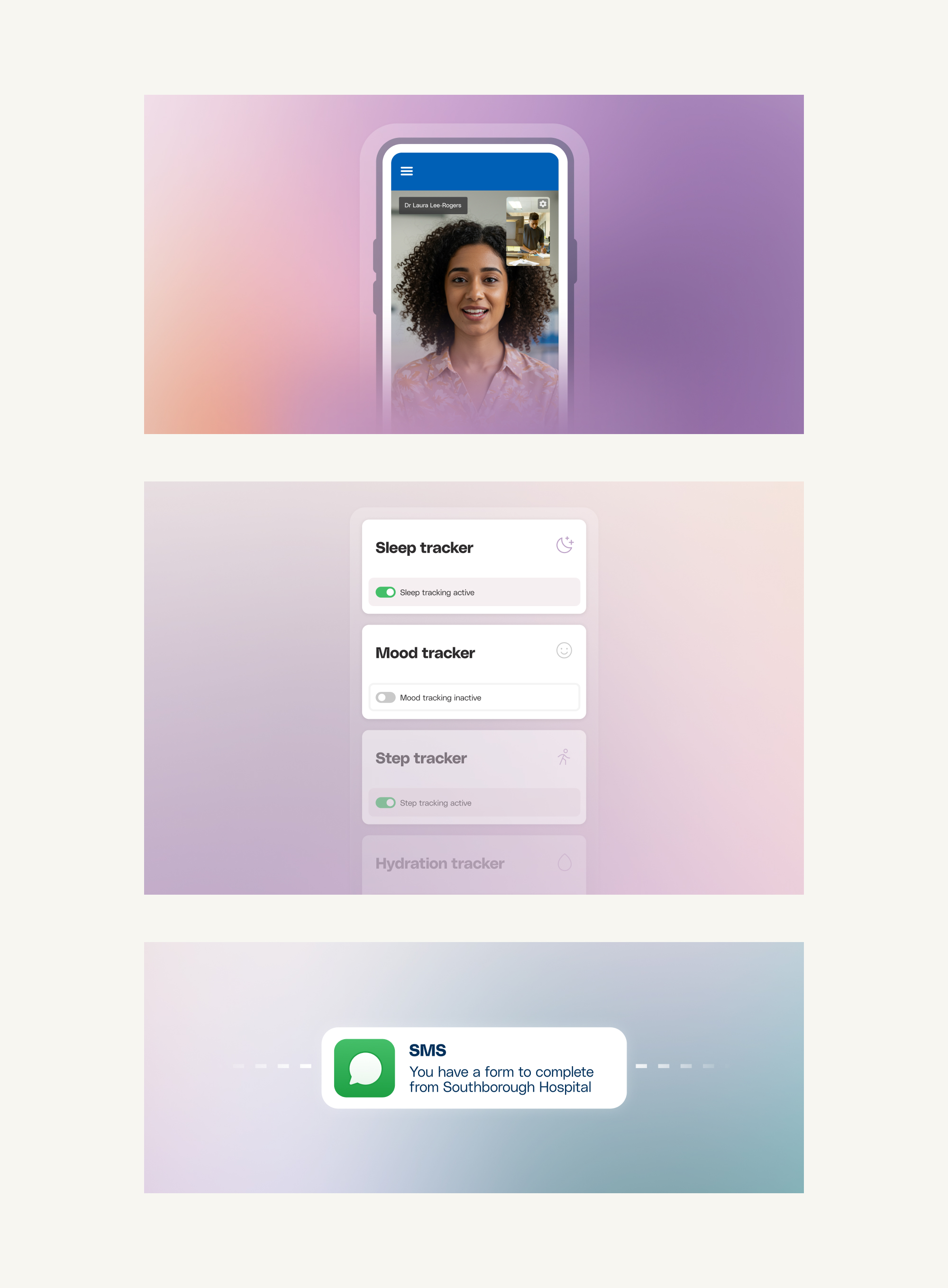
💚 Remote & Patient-Led Care
Patients can confirm or rearrange appointments, access records, complete remote monitoring and receive automated follow-ups – all without needing to call the hospital. The challenge here wasn’t to visualise technology. It was to visualise confidence and autonomy.
📝 In summary...
DrDoctor’s products are powerful but often invisible. This project made them tangible, understandable and easier to sell. I created a cohesive visual system and a library of over 300 assets used across sales, marketing and internal teams.